Location
University promotional materials sometimes need to include our city and state location. Consider using the wordmark/location combination for:
- Print and television advertising that reaches regional and national audiences
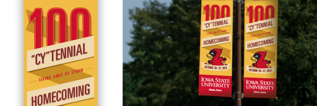
- Printed banners and posters that are used and distributed out-of-state
- University Boulevard banners
The primary wordmark with the location modifier is available for download here.
-
Alignment
The alignment options are left or center aligned, dependent upon the flush placement of the surrounding typography.
Center

Left

-
Area of Isolation
An area of isolation must be utilized for the wordmark to achieve maximum visual impact. Do not place type, photos, or any other high contrast elements within this area. The area of isolation represents the space surrounding all four sides of the wordmark and can be measured by 1/2 of the height of the letter “I” in “Iowa” of the university wordmark.
-
Color
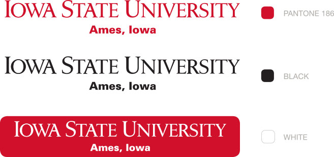
Only the following colors can be used in the wordmark. These colors preserve the integrity of our university identity.
-
Minimum Size
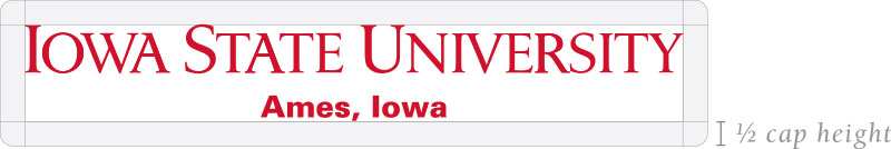
The size of our wordmark's large capital letters (I, S, or U) should be no smaller than 1 pica (.17 of an inch) in cap height, to ensure sharp and legible reproduction. The size of the location, when used, is determined by making the height of the first capital letter in the unit name equal to half of the height of the cap “I” in the wordmark.

-
Trademark Symbols
When the wordmark appears on apparel, it should always have a ® registration notice. When the wordmark appears on any other type of merchandise, including display banners, the ™ notice should be used. The ® and ™ notices are not needed on stationery, marketing collateral or interactive communications.
Correct placements for both the ® and ™ notices with the wordmark are shown below.
Registration

Trademark